You've spent months perfecting your logo. The colors are right, the font is sharp, and it looks polished across your website, business cards, and social profiles. Then you get it embroidered on a polo shirt, and something feels completely off. The letters blur together, the fine details disappear, and the whole thing looks nothing like what you approved. So what happened?
The short answer is that digital files don't always translate well to thread, and it's usually the font's fault.
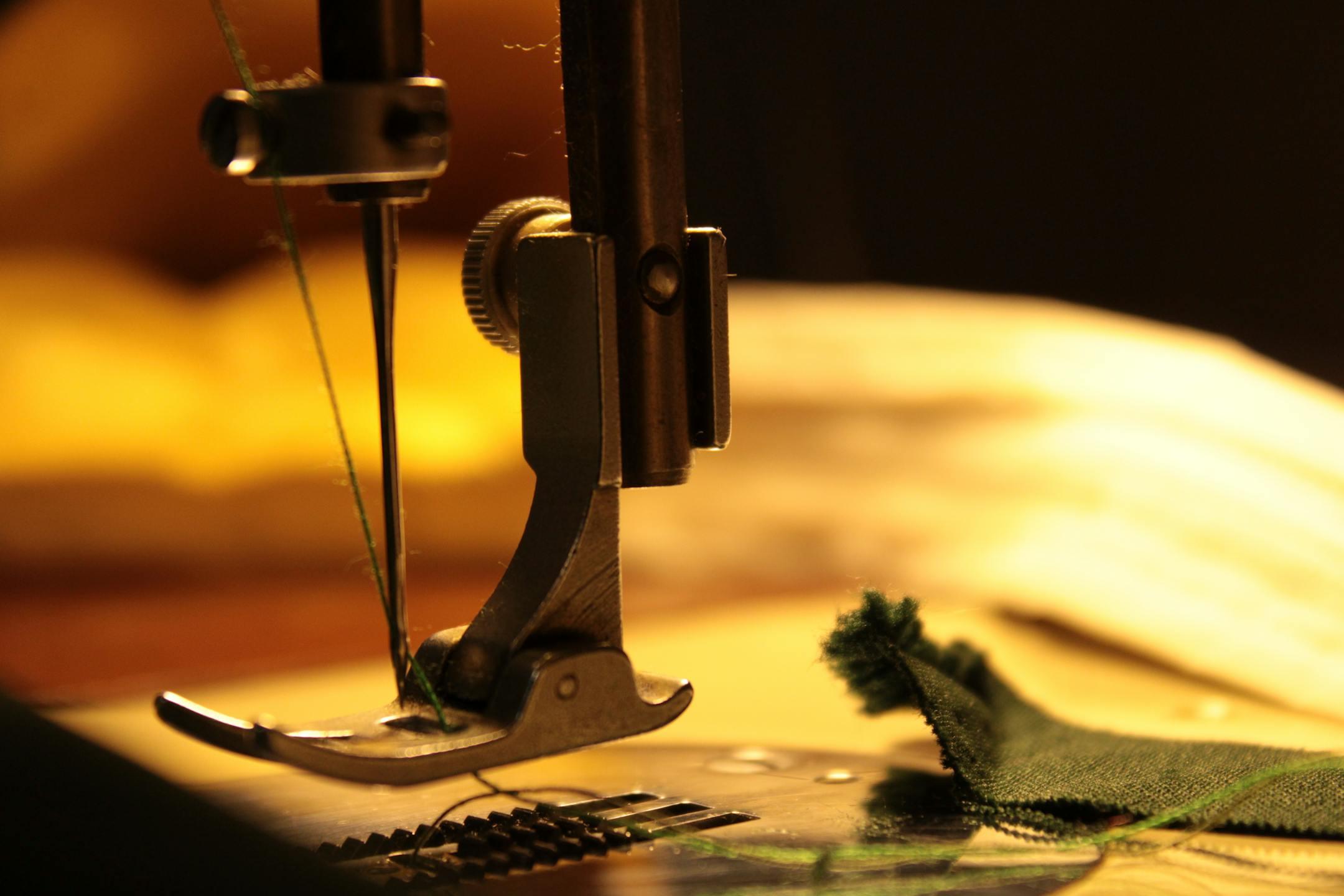
A monitor displays your logo using pixels, tiny squares of light that can shift in color and shape with precision. Embroidery works entirely differently. It's a physical process in which a thread is layered onto fabric with a needle, and that needle has limits. It can't recreate every curve, every thin stroke, or every tiny detail that looks effortless on a screen.
When a digitizer (the person who converts your logo into a stitch file) looks at your design, they're thinking about pull compensation, underlay, stitch density, and minimum stitch counts. None of those things exists in your original vector file. The translation process requires real decisions, and some designs simply don't survive them intact.
Of all the things that can go wrong in the embroidery process, typography is the most frequent offender. Most logo fonts are chosen because they look great at large sizes on a screen or in print, but they weren't designed with thread in mind. There are a few specific ways font choices tend to break down once a design moves from file to fabric.
Most modern logo fonts use thin, elegant strokes to communicate a clean, professional feel. That works beautifully on screen. In embroidery, however, a stroke that's too thin can't hold enough thread to be visible, especially on textured fabrics like polos or caps. The result is a letter that looks broken, faint, or smeared.
A general rule of thumb: any letterform thinner than about 1.5mm is going to struggle in embroidery. That eliminates a huge range of popular typefaces, including most ultra-thin sans serifs and delicate script fonts.
Letter spacing that looks refined on a business card can turn into a jumbled blob on a hat. Here's why: the thread has physical width, and when letters are placed close together, the stitches from one character bleed into the space meant for the next. The human eye fills in the gaps on a screen, but thread doesn't offer the same forgiveness.
Fonts with naturally tight kerning, including many condensed typefaces, are especially prone to this problem. Even if a digitizer adds spacing adjustments, the end result often looks noticeably different from the original design.
Serif fonts carry small decorative strokes at the ends of letterforms, and those details are part of what makes them feel authoritative and polished. In embroidery, those tiny serifs are often the first thing to disappear. When a thread path is too short or too narrow to stitch properly, the machine either skips it or approximates it, and the result rarely resembles the original.
The same issue applies to any fine detail in your logo, including thin outlines, small interior shapes, and intricate linework. If it's not big enough to hold a full stitch path, it won't look right.
While typography is the most common culprit, a few other design elements cause similar problems:
Not every logo needs a full redesign to work in embroidery. Sometimes, small adjustments are all it takes. A good embroidery partner will flag potential issues before production and suggest changes that preserve your brand identity while making the design stitchable.
The logos that translate best tend to share a few qualities:
If your logo doesn't check all of those boxes, that's not a dealbreaker. It just means the digitizing process requires more care and communication.
At Four Seasons Screen Printing, we've seen what happens when embroidery is treated as an afterthought. Our team works with customers from the start to make sure their artwork is set up correctly before a single stitch is placed. We flag font issues, recommend adjustments when needed, and digitize every design with the final fabric and application in mind.
If you're ready to get your logo onto apparel the right way, reach out to our team today. We'll make sure what you see on screen is something you're proud to wear.